The passion for cars runs deep in our corporate culture. In fact every one of our new career postings includes the phrase “passion for cars is a plus”. Naturally conversations outside of client work include some sort of car related subject. A subject gabbed most, TopGear. For those who don’t know what TopGear is, here’s the basic run down: a very popular U.K. automotive show that features 3 hosts with various degree of opinions and feature segments that include car reviews. Using TopGear’s test track on an abandoned airfield, some of the world’s most powerful supercars and non-supercars get put through the ringer by an anonymous test driver (aka “The Stig”). By using the same driver and the same track for each car test, a baseline comparison can be done for each car. For car guys it’s all about knowing which car is the best (aka the fastest) and TopGear provides that knowledge by posting lap times for each car tested.
TopGear data is the very foundation for every car guy’s argument as to why a particular car is better than the other. The only challenge is remembering every lap time record for each car. During an active argument, the realization of not knowing a specific lap time grew into a light bulb moment. How can we compare previous lap times from past shows quickly in order to win the argument? Answer: We need to make a TopGear Infographic. And we did.

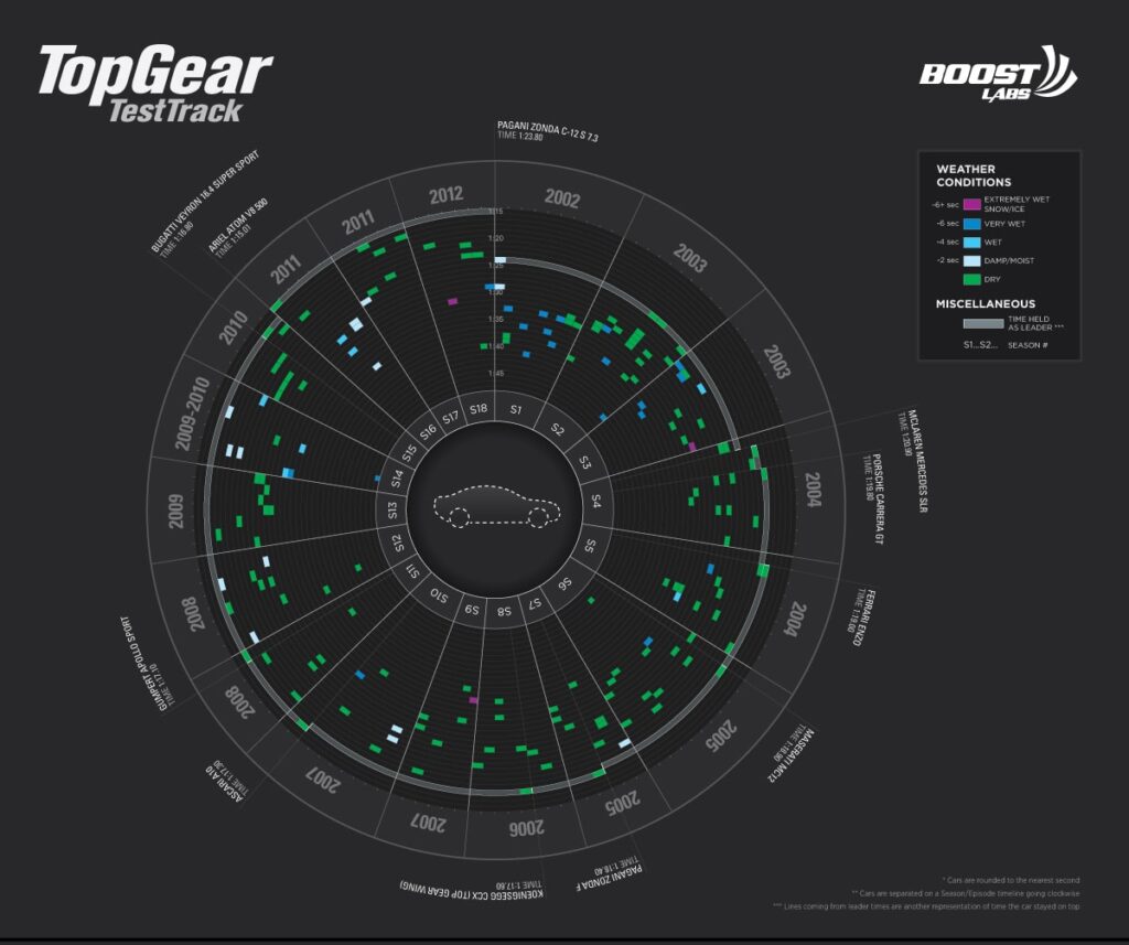
This Top Gear Selector Wheel, as we call it, contains 185 car lap times; showing weather conditions, chronological leaderboard cars, season episodes and years.

In this portion of the infographic we break down the Top 10 Most Affordable cars tested on the track (of the top 50 fastest). Besides showing price, it has the car’s average speed around the track, the horsepower, the weight in pounds, the time around the track and adverse weather conditions (if any). Below that is a little fun tidbit to help inform the viewer about the Top Gear track and their “Tamed Racecar Driver” The Stig.

Who doesn’t love giving out awards? In this section, it helps the user get an overview of the lightest car tested, the fastest time, the car with the most power, the most affordable power, and the car that held fastest for the most episodes. The other three awards were more quirky and fun facts: the Koenigsegg that crashed into the tire wall was the “hungriest” car that Top Gear referenced the situation as the car eating a tire; the “Best Gymnast” award was showing the car that flipped over the most times; and lastly, the “Most Random” vehicle to be on the track — a Harrier Jet.
As cool as the infographic was to make, we realized it wasn’t enough. We need to go interactive with a motion graphic. Stay tuned for the release of our interactive version of the TopGear Infograpic. Release date will be June 1st. Please follow us on Twitter, Facebook or this blog to be kept up-to-date with news and information in regards to the interactive version.