What’s the weather like today? Chances are, you’ve already checked this week’s forecast on your phone. Making sure you’re dressed appropriately or making sure you have an umbrella for the rain is just part of the day. Natural disasters like tornados are usually contained to certain areas , so most of us don’t have to think about living in Tornado Alley. But the weather is more than just forecasts. For every storm and earthquake, scientists have made countless analyses and predictions. Forecasts might not be 100% accurate, but they’re intended to warn and prepare the public. And thanks to data visualization, both scientists and the public can easily make sense of all that data. There are endless terabytes of data that are turned into maps, graphs, 3D models, and interactive designs.
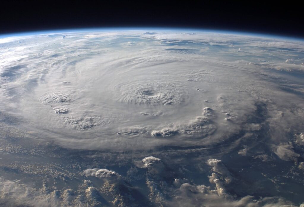
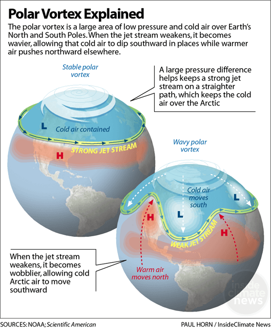
Consider the wind, for example. On a global scale, wind is the large scale movement of air. Wind patterns like the polar vortex create changes in the weather and environment, sometimes bringing extreme temperatures and weather.
These patterns and changes only exist as data at first. It then needs to be translated into a visualization before it becomes a polished, easy-to-understand forecast.
Why is the data so important?
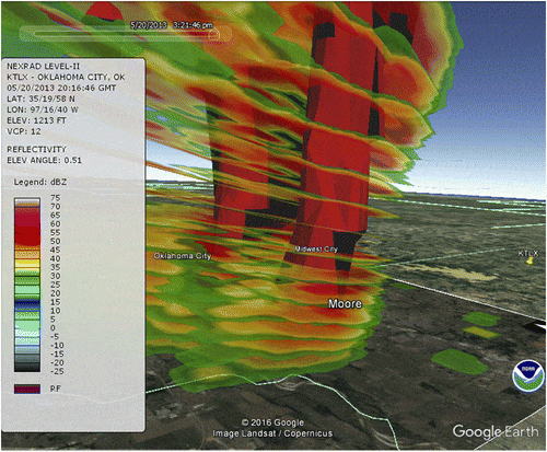
Remember when Helen Hunt and Bill Paxton used small sensors to track the movement of a tornado? Those sensors were designed to ride the winds of a twister while emitting signals for easy tracking. The signals contained data about wind speed and direction, which ultimately warned them in time to save them. And just like this 90’s adventure film, weather and natural disaster data is collected to track, predict, and prepare. Sensors, radars, satellites, and other technology collect temperatures, speeds, movement, and more. These are the details that warn us when a hurricane is brewing or seismic activity indicate a strong earthquake.
Once we know what’s going to happen, we can prepare. Safety is a top priority when these events arise and forecasts help us prepare for the worst. Maybe it’s stocking up on water and non-perishable foods or evacuating the city, any scenario is better with a forecast. Visualizing data also improves response time by providing agencies and emergency employees with real-time metrics.
What do you do with the data?
Now, there’s so much data that it’s hard to keep up with all of it. And translating all those numbers and locations isn’t easy. That’s where data visualization comes in. Scientists study historical data to look for patterns and identify current weather with better precision. The data can’t prevent a storm or an earthquake, but it warns us. The Virginia Institute of Marine Science has been looking into data visualization to warn residents in coastal towns of flooding. Residents would be warned before an imminent flood and how long it’s likely to last so they can prepare homes or evacuate as needed, thanks to the data analysis. Machine learning and 3D modeling has further helped scientists understand different scenarios.
When Disaster Strikes
At the height of any disaster, the damage is just as dangerous as the event. Damages from major natural disasters are incredibly costly and some places never quite recover. Financially, governments can spend hundreds of millions and never restore the infrastructure. People become homeless, jobless, and have little to no access to clean water, food, and medical help. But the aftermath can ripple out, affecting other areas and people.
The San Andreas fault line runs through California, resulting in frequent earthquakes. Seismic activity is monitored to predict a quake, but it’s not the only concern. Structural vulnerability is a danger that faces buildings in Los Angelos. An earthquake might not kill you, but a collapsing building can. After facing a Hurricane Maria, Puerto Rico was ravaged and thousands were dead. Surely, no one in America though they would also face consequences from the storm. Puerto Rico had been a major manufacturer of IV saline bags for the US, but after the storm, American hospitals found themselves with a critical shortage of IV bags.
Data visualization works to save lives in different ways. So, the next time you check the forecast, remember how important weather data is and don’t underestimate the importance of data visualization.