A dashboard in a car is a control panel with a range of indicators. Digital dashboards are very similar. They’re designed to display data context via visualizations. By consolidating large data sets, you’re able to see a clearer data story. A digital dashboard is one of ways clean water data is analyzed. It visualizes data points that are critical to maintaining safe drinking levels and accessibility to clean water.
70% of Earth is covered in water. 3% is fresh water but 2.6% is inaccessible, leaving only 0.4% of usable fresh water for the entire world. but even that 0.4% isn’t completely available.
What does a dashboard do for you?
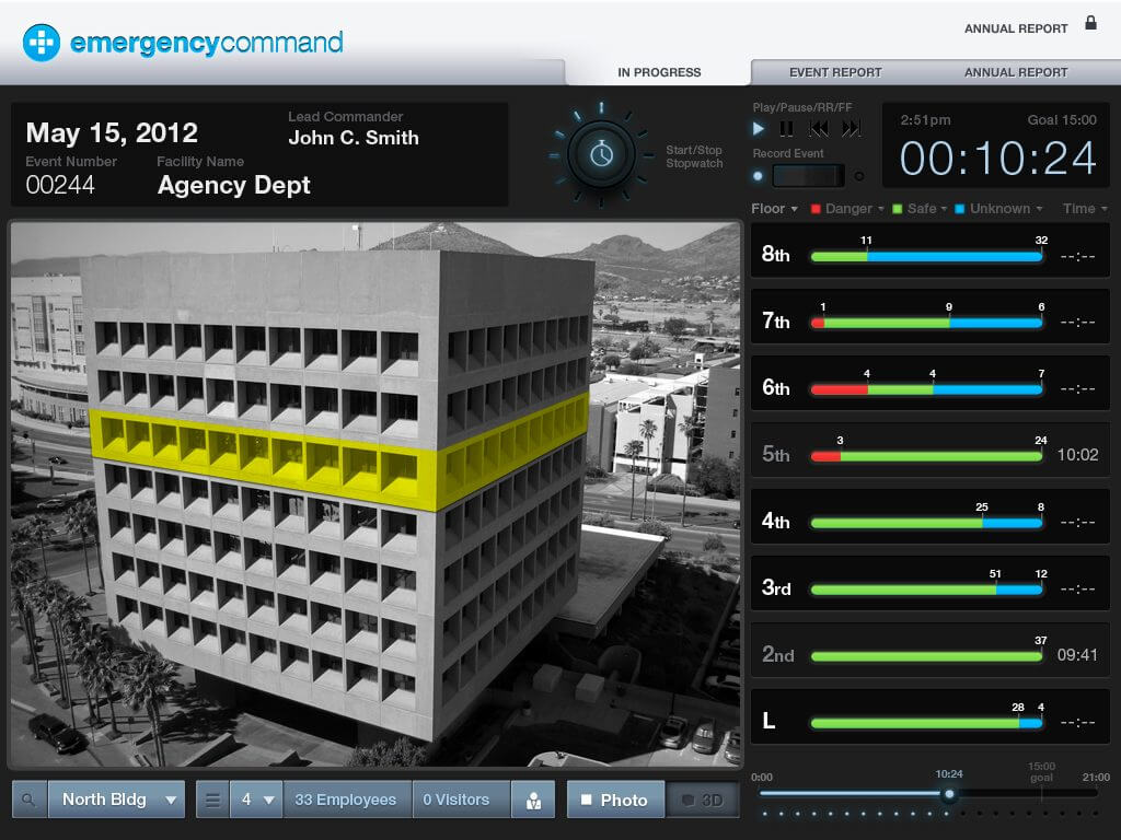
Because a dashboard tracks multiple large data sets, you’re able to derive insights more quickly. Instead of going through raw data, a dashboard will display key metrics in an easy-to-read visual, like these.
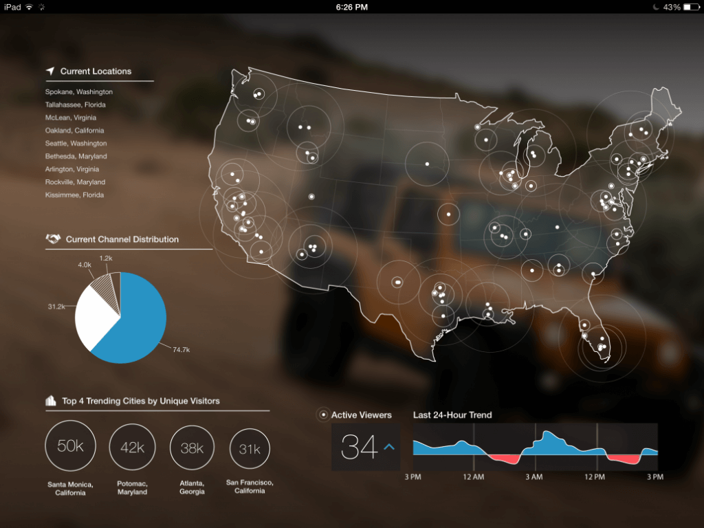
Multiple key performance indicators (KPIs) are framed in one control panel for deeper analysis. In the US, the Environmental Protection Agency (EPA) analyzes crucial data and pushes for regulation. The EPA also uses dashboards to display water quality all over the US (check out the comparative dashboard to see clean water quality in your state).
Right now, data has shown us we’re already in a water crisis and it’s only getting worse.
Data and our drinking water
Water contamination occurs very easily, so it’s imperative to monitor the data as closely as possible. Contaminants (metals, chemicals, sewage, etc) are measured to avoid dangerous levels and warn residents, but the data shows we aren’t the change we need. Studies show that many Americans are already consuming contaminated tap water and it’s all across the country.
And this isn’t the only water you need to analyze. Most of Earth’s water isn’t drinkable. The freshwater supply cannot keep up with the exponential population and unsustainable human activity. Many regions are already water-stressed and in less than a decade, you could be living in a water-scarce area. If your city regularly faces natural disaster or is home to factories, you’re more likely to have contaminated water. More data suggests that political response and infrastructure is vastly different across the stratification of race and class. Water quality is an unintended measure of inequalities around the world.
What happens to the data?
In Flint, Michigan, it’s been 5 years since local government negligence poisoned the city and it’s still destroying the community. And since then, there have been more infrastructural failures that threaten clean water access. Data can only do so much when the federal government doesn’t respond to demands for regulation. PFAs (polufluoroalkyl and perfluoroalkyl substances) are raising emergencies around the US, but the government has yet to intervene.
Experts have predicted global water demand will increase by 55% in just 50 years, a rate that uses fresh water faster than it can be replenished. Violence over water conflicts is not a new thing and it might spell our future relationship with water. So how can dashboards (or any other data visualizations) help? Dashboards make data analytics easier so we can extract better insights. Knowing why and how we need to change can ease clean water crises and sway people to change.
Check out the World Health Organization’s Drinking Water fact sheet for statistics and info.